Fritto
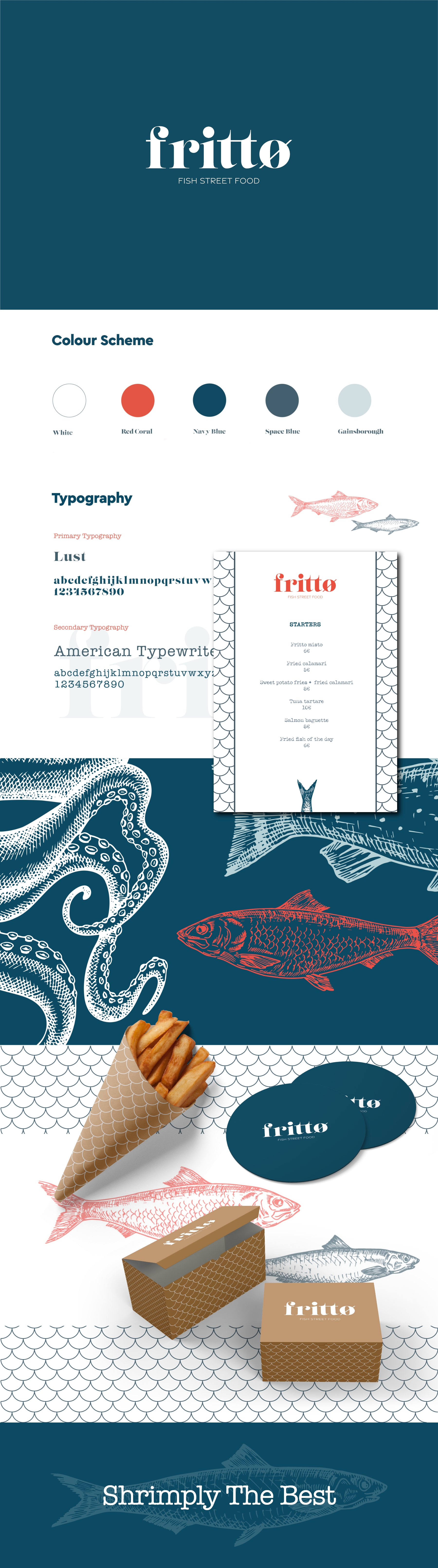
As the name implies, this eatery is a street fried food concept serving authentic Italian recipes mainly fish. The tone of voice has a Nordic influence which is also reflected in the strong print to the brand. The slashed ‘O’ in the typography is a manifestation of the Scandinavian feel which is also a representation of the target audience.
Scope:
Packaging, Naming, Brand Strategy, Collateral Design, BrandingShare:
Get in touch!
We'd love to hear from you!